
GOTTA GO TRAVEL APP CASE STUDY
THE PROBLEM:
Travel apps have traditionally prioritized the booking of hotels, flights, and car rentals, often overlooking the potential for fostering connections and facilitating customized trip experiences. By reframing the purpose of travel apps to incorporate a comprehensive platform for linking and connecting travelers, users would gain the ability to curate personalized travel packages that align with their unique preferences and interests. This expanded functionality would allow users to connect with like-minded individuals, share itineraries, collaborate on trip planning, and potentially even coordinate group activities. By transforming travel apps into social hubs that facilitate meaningful connections and enable the creation of tailored travel experiences, users would enjoy enhanced engagement, a sense of community, and the opportunity to explore destinations in a more personalized and enriched manner.
THE SOLUTION:
The design of Gotta Go, a social travel app, was conceived to revolutionize group travel experiences. With a focus on shared cost and collaborative planning, the app empowers multiple travelers to embark on memorable journeys together. By leveraging the power of social connectivity, Gotta Go enables seamless coordination, expense sharing, and itinerary collaboration among group members. Through intuitive features and user-friendly interfaces, the app aims to enhance the efficiency, enjoyment, and affordability of group travel, fostering meaningful connections and creating unforgettable adventures. With Gotta Go, travelers can embark on collective explorations, making their trips more inclusive, collaborative, and financially accessible.
MY ROLE:
UX designer (individual project)
UX designer (individual project)
TOOLS:
Abode xd, Insightly, Miro
Abode xd, Insightly, Miro
INITIAL RESEARCH
In this phase, I wanted to wrap my mind around what innovation could be brought to the travel space. I wanted to generally understand how consumers planned and thought about travel.
INITIAL USER RESEARCH
ASSUMPTIONS
-Travel sites don’t function the way people think of their travel
-People want the right price: this is defined as a balance between price and value
-People don’t always know where they’re going
-People want to be inspired to travel
-People want the right price: this is defined as a balance between price and value
-People don’t always know where they’re going
-People want to be inspired to travel
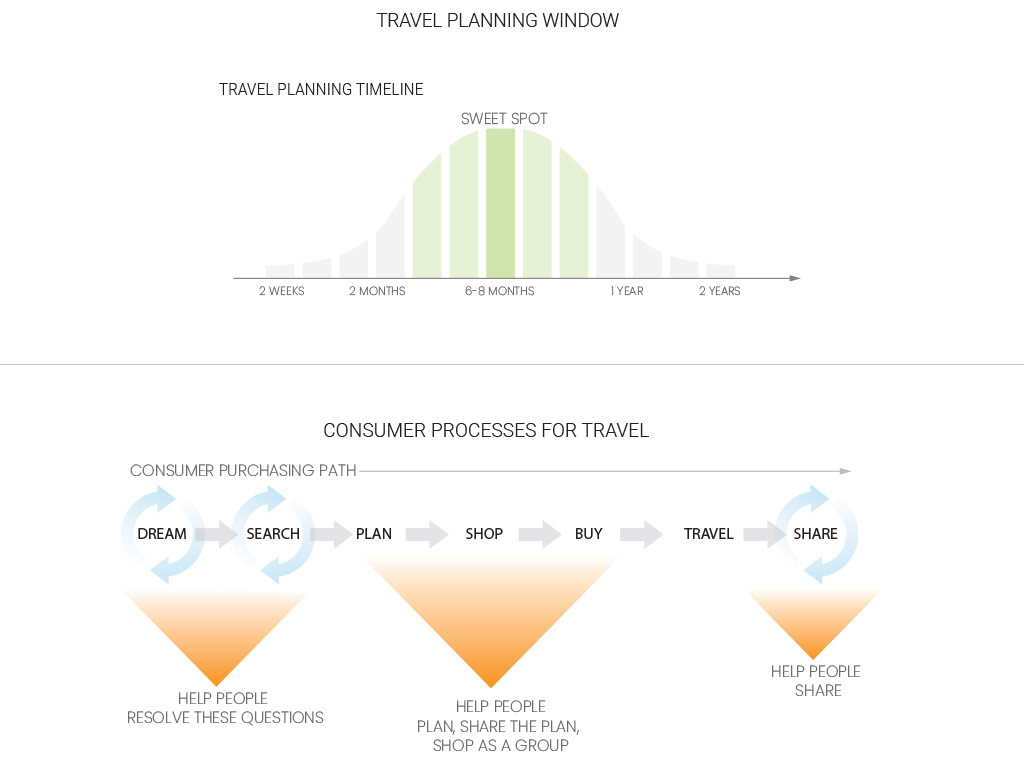
BROAD ANALYSIS OF THE MARKET
“Funnel Revolution.” Put simply, a funnel is made up of the phases a user goes through for a trip – dream, search, plan, shop, buy, travel, and share.
“Funnel Revolution.” Put simply, a funnel is made up of the phases a user goes through for a trip – dream, search, plan, shop, buy, travel, and share.
“Around six to eight months is probably average,” said Jessica Silber
“(decision simplicity index) top quarter in our study were 86%
more likely than those in the bottom quarter to be purchased
by the consumers considering them”
more likely than those in the bottom quarter to be purchased
by the consumers considering them”
“In demanding ever more attention from overloaded
consumers, brands ultimately lead them down unnecessarily
confusing purchase paths.”
consumers, brands ultimately lead them down unnecessarily
confusing purchase paths.”

EMPATHY MAP
Using the technique of empathy mapping, I wanted to frame what I had learned from interviews into a pain and gain matrix, giving more direction to the project.
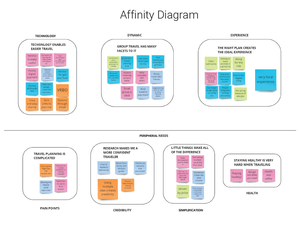
AFFINITY DIAGRAM
After the empathy map, there was an need to define the problem from a different direction and set up what was needed to what was peripherally needed.
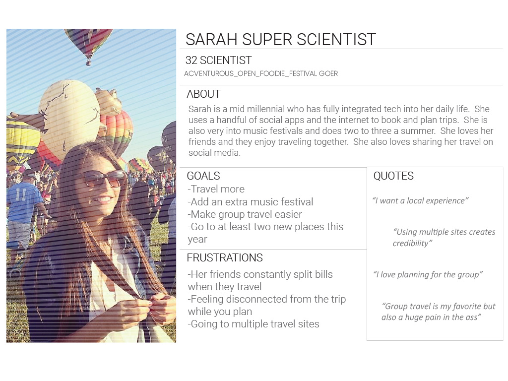
USER PERSONA
To help verify making decisions while designing the app, i needed to be able to reference a consumer to connect with their thoughts and needs. So i created a persona that would allow me to connect with a generalized consumer while designing the product.
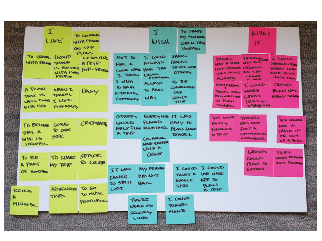
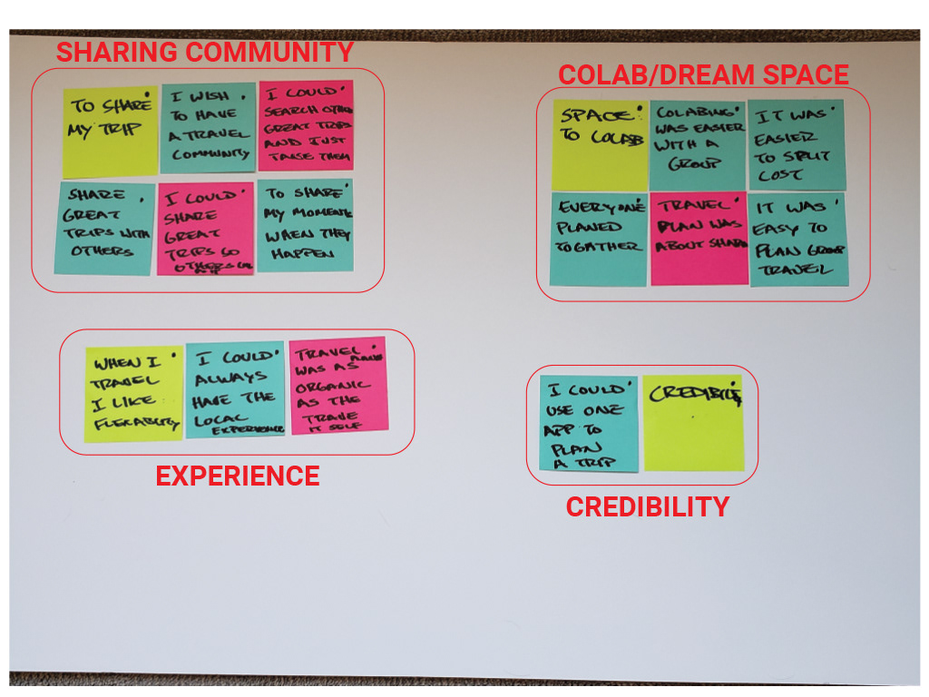
LIKE, WISH, WHAT IF
What was liked in the current space? What would be wished for the app? What if anything was possible? Then after this exercise, I grouped the ideas into categories.
4 PILLARS OF THE APP
Once all the research had been complied i created groups of what the app needed.
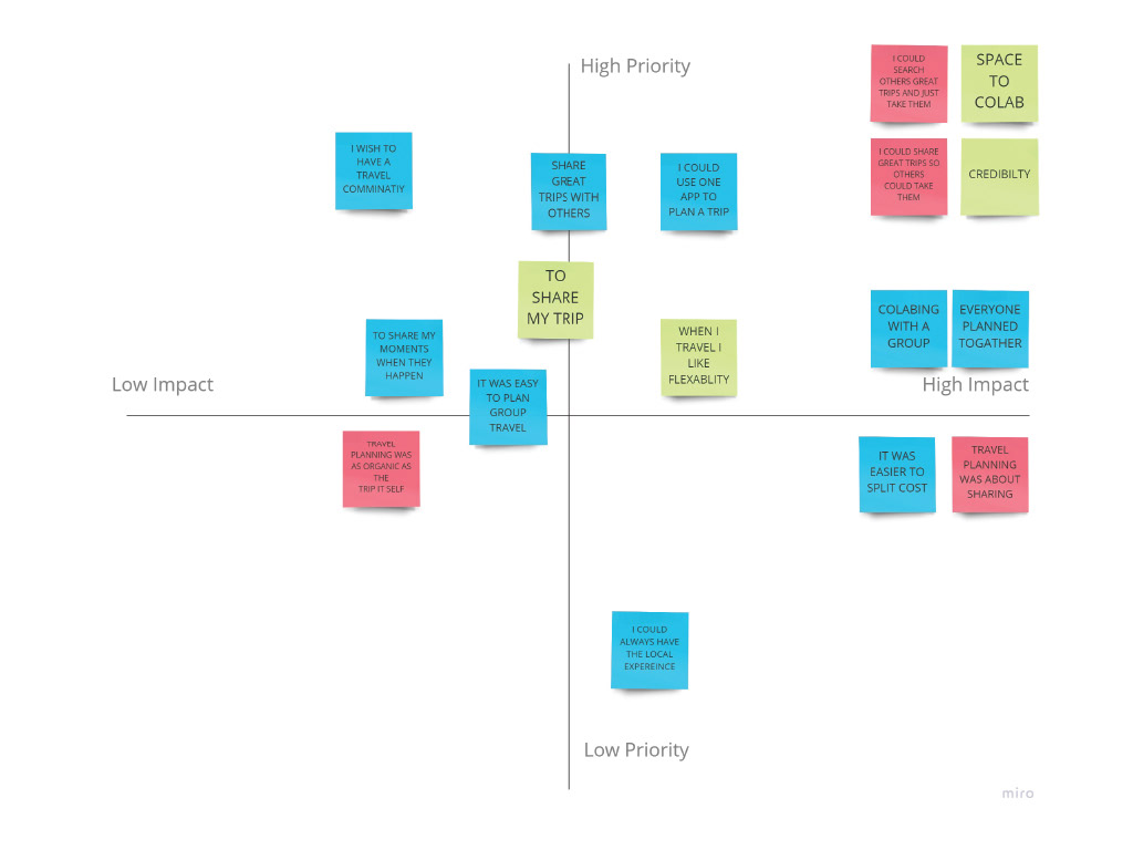
PRIORITY TO IMPACT
What was a high priority to high-impact area to focus on? Low-impact/low-priority areas do not need to be focused on.
FULL PROBLEM STATEMENT
Given what was found during the initial user interview and general marketplace behaviors, it became clear that what is needed to help consumers is not another app that gives information. What consumers need are three distinct
spaces to plan and collaborate with their group or others. The app should resemble something more akin to a social media app like Pinterest or Instagram.
With this idea in mind, three spaces were identified. Space 1 is what is
called the dream space. Space 2 is what is called the collaboration space.
Space 3 is the sharing space. These spaces will allow the user to have a much more
natural and organic planning experience than what is currently provided by the
methods the user has available to them.
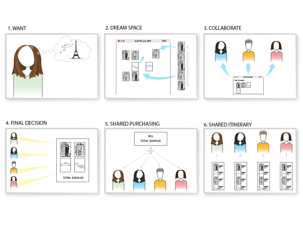
USER SCENARIOS/STORYBOARD
Generally, how would someone use this app? What would the flow or general use case for the consumer be?
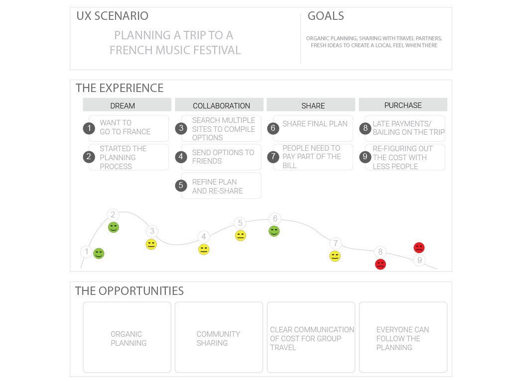
UNDERSTANDING FRUSTRATIONS
At what points in the process are consumers going to be happy or frustrated with the process? This shows us where to pay close attention to the user.

USER FLOW
What happens as the user tries to book a trip in the app? What are the steps they will take? In this flow, there are 3 different spaces the user will spend time. 1st, the dream space is the area where the user will broad stroke their trip, all of their dreams, and expectations for the trip. The collaboration space is the area where if they are planning a trip with a group, they can explore options that work for everyone. The sharing space is where the trip can be shared with the group members or other members on the site. It also can help with payment from multiple people to make the trip a reality.
At (Gotta Go) we are developing a social travel app that will help Millennial Travels by providing a (Dream Space) and sharing community. This will make group travel and planning easier. This will be accomplished by creating a community that dreams and shares together. There will be confidence in the final planning because the site will pull from all major travel providers.

ROUGH SKETCHING THE APP
Through multiple sketches and play, working through how the app might function and best present the innovation proposed by the app's wants and needs.
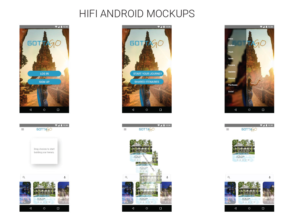
HIFI MOCKUPS
The more polished look and feel for the app. I was using adobe xd to create hifi protos to test with consumers. Everything was covered by the prototype - the look and feel, interaction, and different environments. Please see the link below for live proto.
In conclusion, there are some very big next steps in the creation of the Gotta Go Travel App. Deep user testing is needed to be applied to the HiFi Prototype. There are some interesting aspects to work out in regard to using a drag function on a mobile device. The High Fidelity Proto allows users to understand the in and out function of drag and drop. There are some zoom slash scaling functions to make the process more manageable for the end user. Also, a deeper dive into the option bars to set price ranges is needed. Would people want drop-downs or sliders? What would be a good range before each of the options? Overall, it still feels like there is a lot of work to accomplish, even before considering coding or any finished app steps.