DEPARTMENT OF THE INTERIOR WEBSITE RE-DESIGN
THE PROBLEM:
The Department of Interior website lacks clear information organization and a well-defined hierarchy, leading to difficulties in locating specific content and navigating through relevant sections. Users struggle to find relevant information due to inconsistent labeling, scattered content placement, and unclear categorization. The absence of intuitive navigation pathways and an ineffective search function further exacerbates the issue, making it challenging for visitors to efficiently access the desired resources. As a result, users may experience frustration, decreased engagement, and an increased likelihood of abandoning the site in search of alternative sources that offer more streamlined and structured information presentation.
THE SOLUTION:
Through careful refinement, our goal is to enhance the website's user experience by prioritizing and improving the accessibility of the most frequently used features. By conducting user research and analysis, we will identify the key actions and functionalities that users engage with the most. With this knowledge, we will strategically optimize the site's navigation, layout, and information architecture to ensure that these essential elements are readily accessible and intuitively organized. By streamlining the user flow and reducing friction points, we aim to empower users to effortlessly access the features they rely on, resulting in a more efficient and satisfying website experience.
Through careful refinement, our goal is to enhance the website's user experience by prioritizing and improving the accessibility of the most frequently used features. By conducting user research and analysis, we will identify the key actions and functionalities that users engage with the most. With this knowledge, we will strategically optimize the site's navigation, layout, and information architecture to ensure that these essential elements are readily accessible and intuitively organized. By streamlining the user flow and reducing friction points, we aim to empower users to effortlessly access the features they rely on, resulting in a more efficient and satisfying website experience.
MY ROLE:
UX designer (individual project)
UX designer (individual project)
TOOLS:
Abode xd, Insightly, Miro
Abode xd, Insightly, Miro

INITIAL RESEARCH
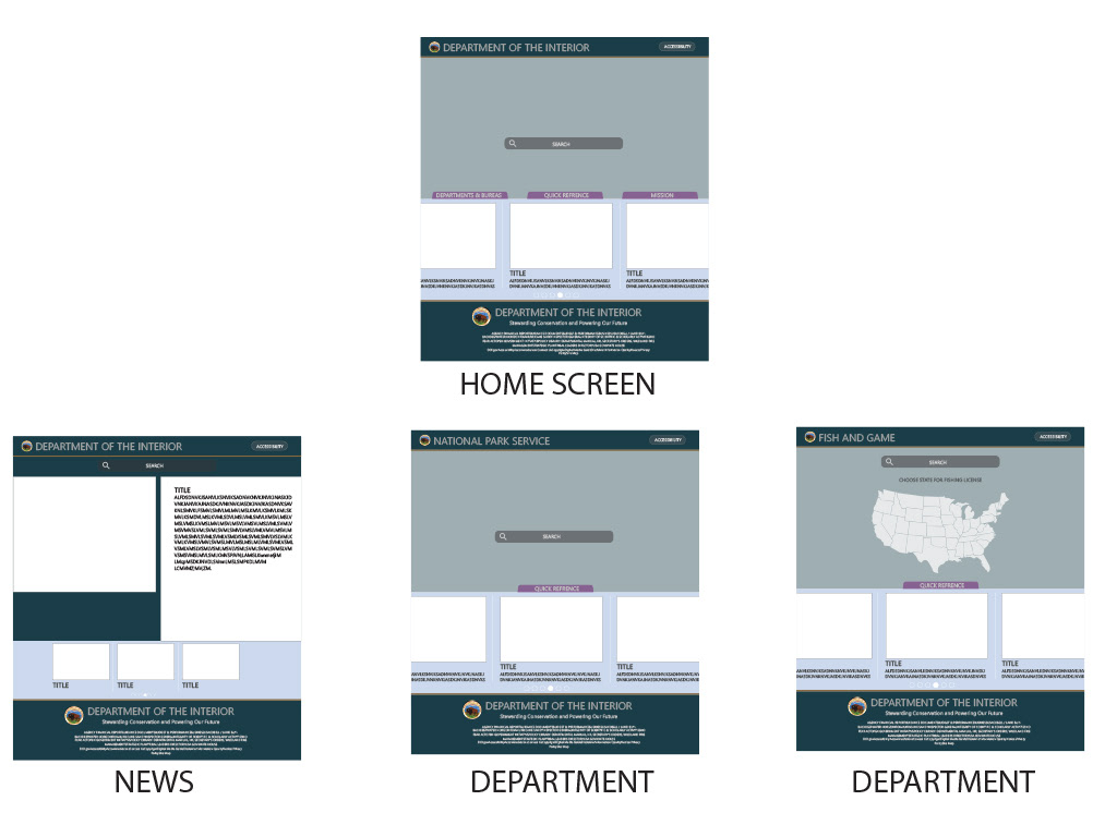
The general layout and structure of The Department of Interior branches and departments.

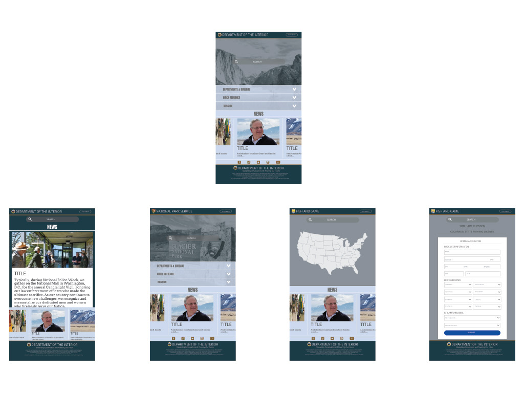
USER FLOW PATH (BEFORE TESTING)
User flow path using the current website.
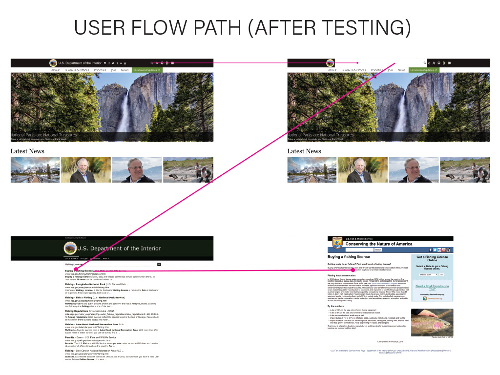
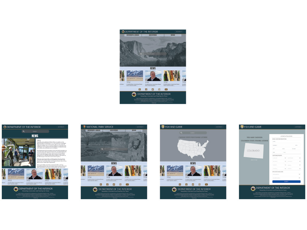
USER FLOW PATH (AFTER TESTING)
What would be the ideal flow path after testing?

USER TESTING
High impact and high priority organized from the user testing.
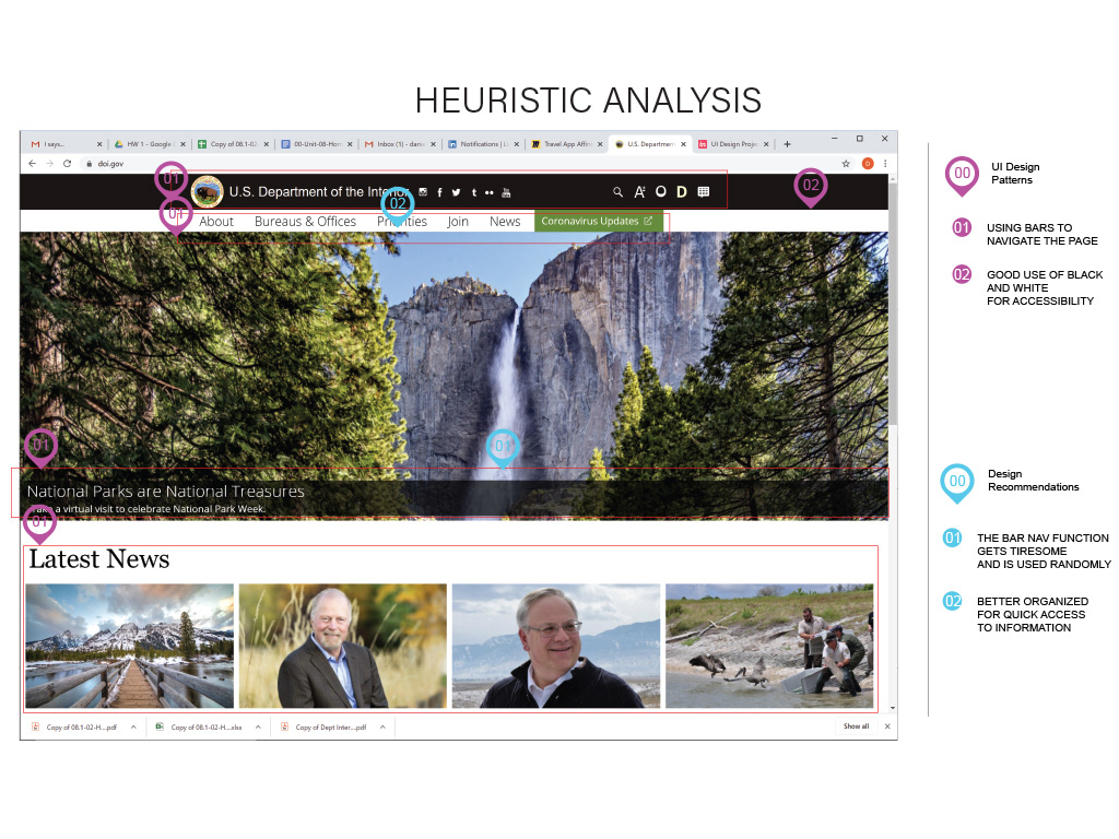
HEURISTIC ANALYSIS
During this phase, I wanted to recommend design changes based on UI patterns that were positive during the user testing.
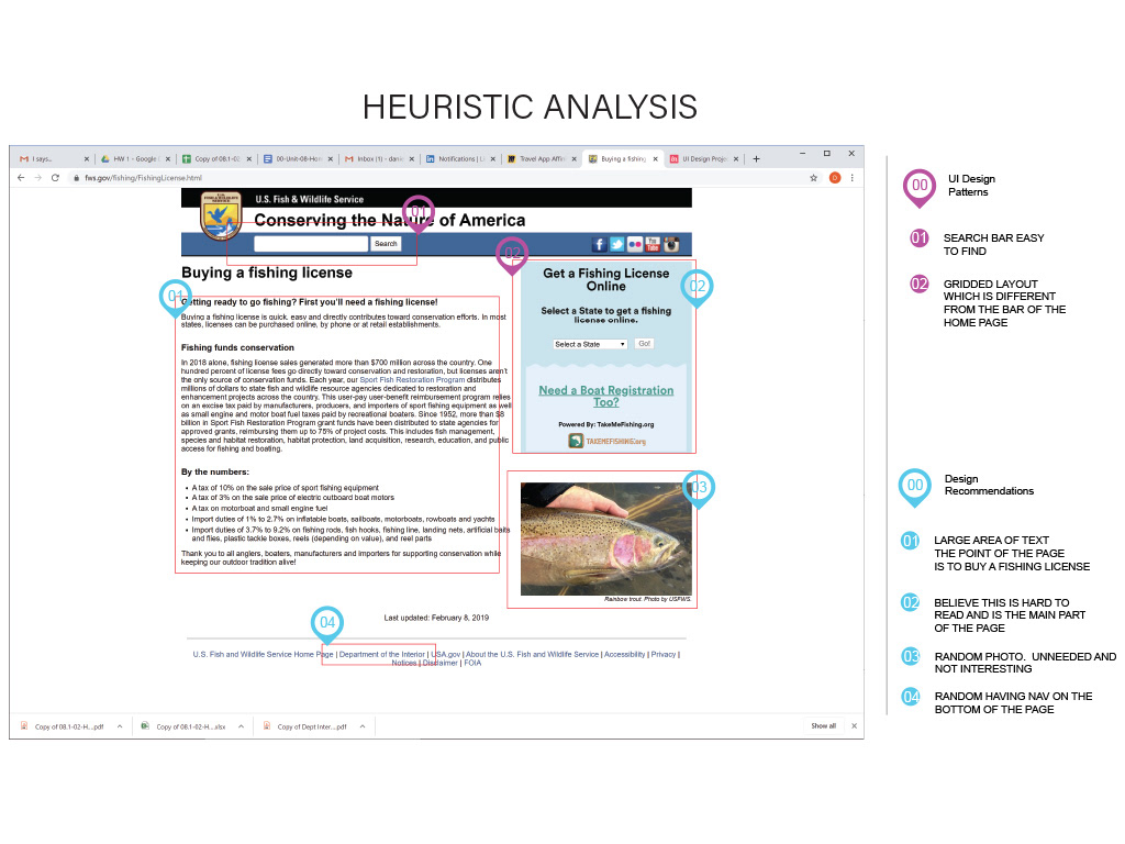
HEURISTIC ANALYSIS
One of the goals of the project was to improve the fishing license application process. This page was the entry port to the application.
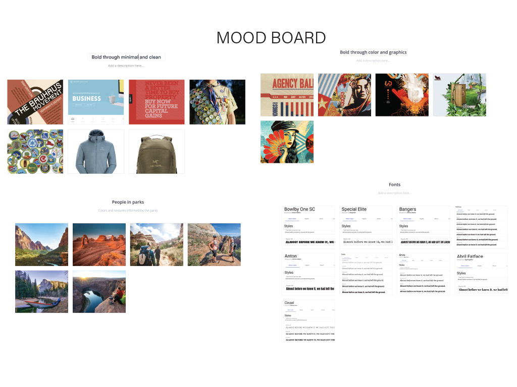
MOOD BOARD
Trying to bring a fresher look to the government websites. Something that would be easier to navigate and also be better visually.
COLOR PROCESS 1
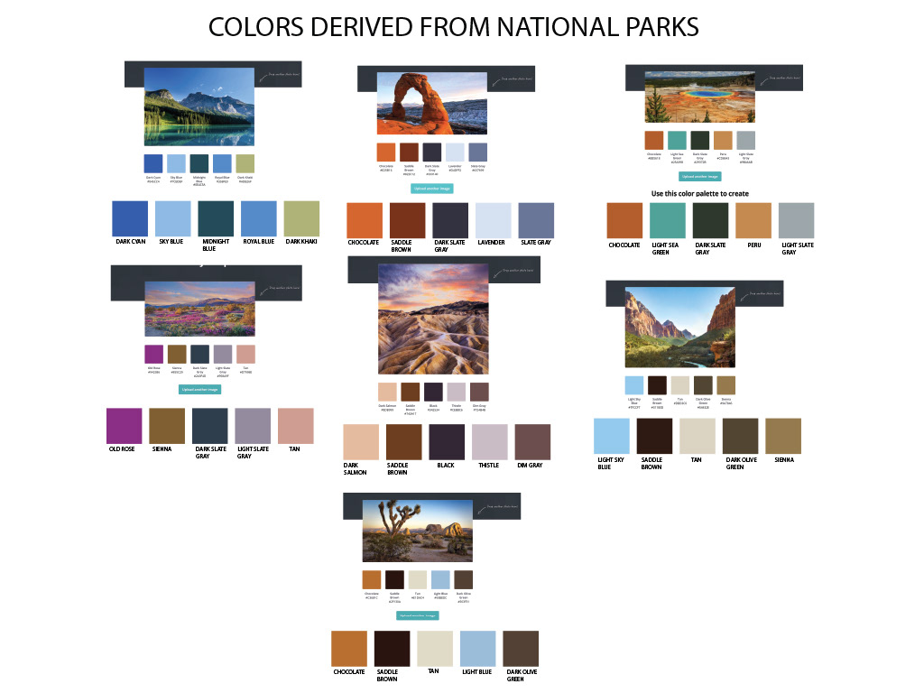
Using photos from national parks, I derived some color pallet options. The national parks are an important part of the DOI websites.
COLOR PROCESS 2
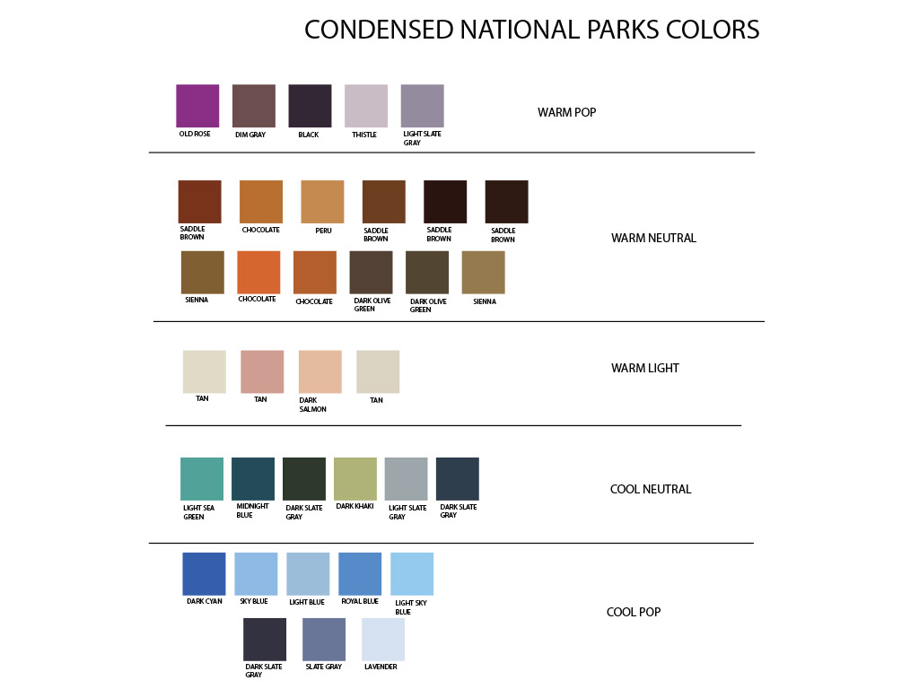
Once a range of colors was created, I then used them to create like color grouping to help pick out and organize the options.
COLOR PROCESS 3
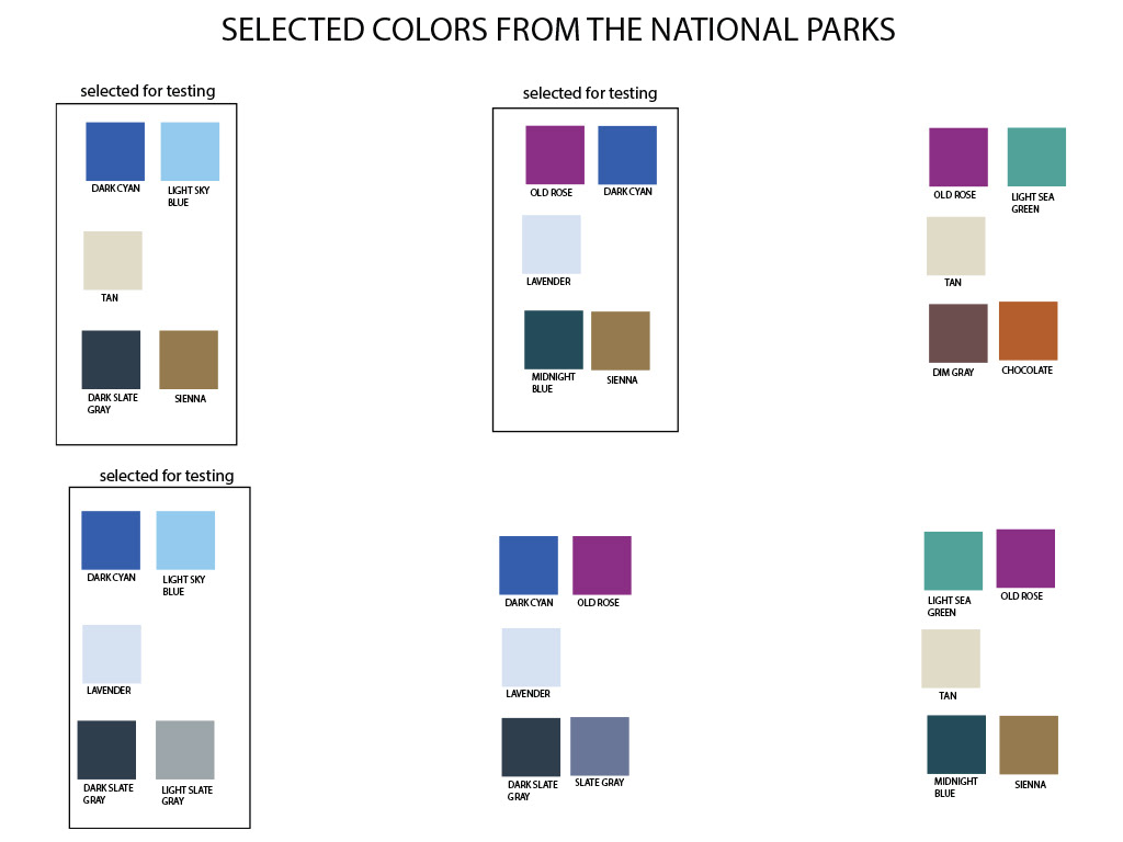
Once they had been grouped into like colors, I experimented until I found combinations of colors that worked well together.

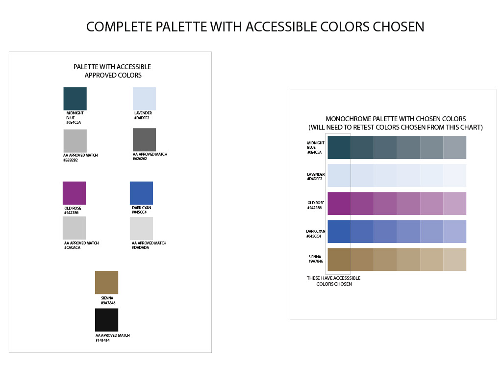
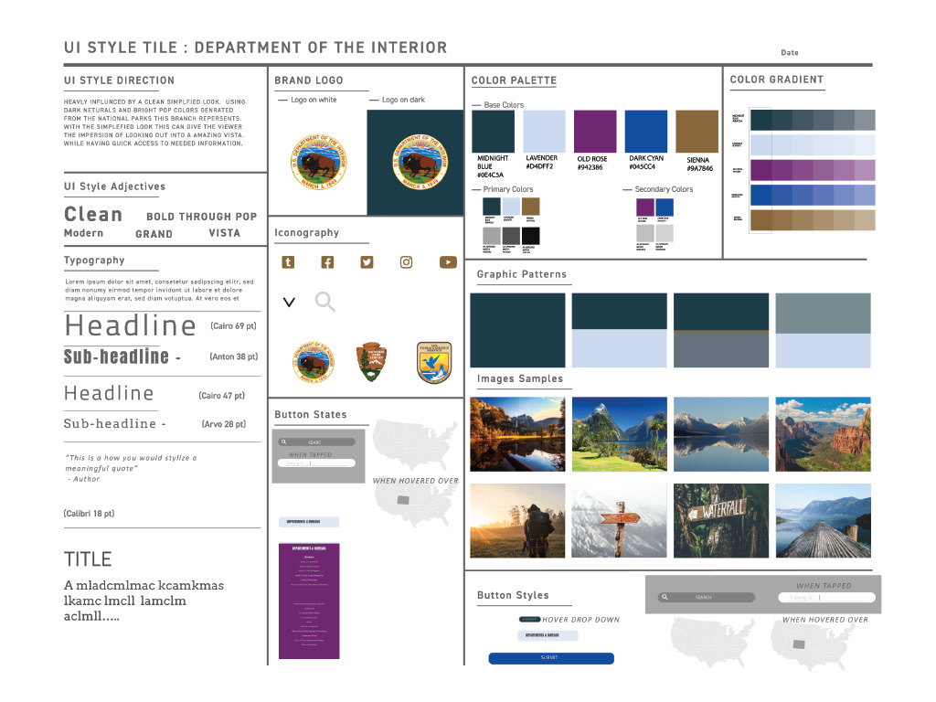
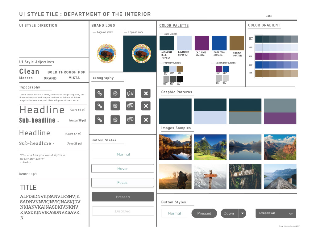
FINAL COLOR PALETTE
Once the initial palettes were created. I tested them in a mock layout to see how they might look. Once that was done, I then tested the colors in combination to drive accessible colors, which looked good together. Here is the final created palette.